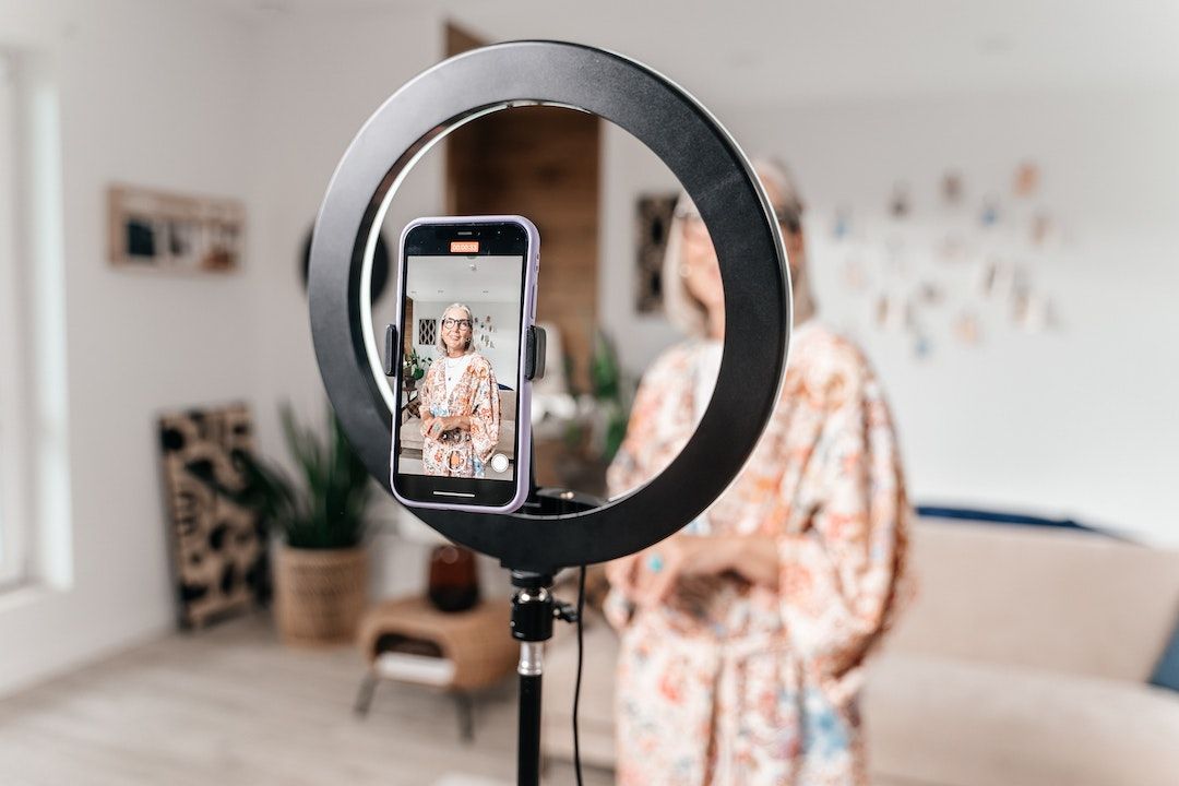
The modern content feed never stops. With every scroll, a new volley of videos tries to capture a split second of attention.
In this crowded arena, the thumbnail and the title act as both a billboard and a headline.
Miss that first impression and the algorithm pushes your creation behind the next wave of posts — a risk shared by all content creators relying on organic marketing.
Definition of key terms
Click-through rate (CTR): percentage of impressions that turn into views. A thumbnail is the still image representing the video; the hook (or title) is the text that announces its value.
Each platform counts a “click” in its own way — a tap on YouTube, a swipe-stop on TikTok, a selection on Instagram — but the question remains the same: did the visual trigger the action? The answer depends as much on form as on substance, two aspects detailed in our content marketing guide.
Guide outline
We will explore :
- the psychology of millisecond decisions;
- design and copywriting principles;
- platform-specific tactics;
- workflows, case studies, and checklists you can use right away.
To go further, read our article on choosing the right platform for your audience.
The psychology behind the click
Dual-process theory : System 1 vs System 2
Neuroscience shows that most scrolling decisions come from System 1 — fast and instinctive.
When System 2, more analytical, kicks in, the finger has already moved on. Effective thumbnails and titles therefore speak first to instant judgment, then reward slower reflection after the click.
Knowing how to map your audience helps calibrate these two levels of persuasion.
Salience and visual attention
Eye-tracking studies reveal that viewers latch onto high-contrast elements and expressive faces in 50 to 100 ms.
Opposing colors, diagonal lines, and emotion-loaded expressions divert “bottom-up” attention before we even consciously choose what to look at. The principles around the importance of images in SEO apply here in the same way.
Curiosity and information-gap theory
We click when we perceive a gap between what we know and what we want to know. The “Goldilocks” zone sits between content that is too obvious and content that is too vague.
A meta-analysis of 27,000 headline tests (2025) showed that variants with a moderate level of specificity generated the biggest CTR lifts — a principle at the heart of the AIDA frameworks described in our storytelling framework.
FOMO, loss aversion, and social proof
Scarcity and risk avoidance remain primary drivers. A countdown (“only 24h left”) or social proof (“seen by 3 million traders”) encourages people not to miss out.
A Criteo study on display ads reports an average 14% lift thanks to FOMO messaging, illustrating the conversion power of urgency.
Emotional triggers and affective responses
Emotionally charged words — positive (“incredible”) or negative (“shocking”) — activate the amygdala and give the content a sense of importance.
Pairing these words with a matching facial expression in the thumbnail amplifies the effect, especially if your personal brand is already recognizable.
Visual best practices for high-CTR thumbnails
Color and contrast
- Highly saturated palettes stand out against the mostly dark backgrounds of YouTube and TikTok.
- Bold complementary pairs (orange-blue, purple-yellow) direct the eye to the focal point.
- An analysis of several million thumbnails attributes a potential CTR gain of 20 to 40% to strong contrast
To reinforce identity, a consistent visual mesh is just as essential as good internal linking in SEO.
Faces and emotional expression
The human brain is wired to decode faces. A single expressive subject — eyes wide open, heightened emotion — generally outperforms an overloaded group photo.
Industry A/B tests show that face-centered thumbnails beat versions without a face by about 20%, a gap even more pronounced in influence marketing.
Composition and clarity
Reduce the frame to one strong idea. Place the subject using the rule of thirds, keep a neutral background, and reserve negative space for text. Every extra element increases cognitive load.
Text on the thumbnail
Three to six words are the sweet spot for mobile readability. Choose a bold sans-serif font, add a stroke or shadow for separation, and avoid ALL CAPS unless your style guide requires it.
Accent graphics and branding elements
Arrows, circles, or subtle halos guide the eye without overwhelming the viewer. Add a discreet logo (10 % of the frame maximum) to build familiarity.
Technical specs and tools
Stick to native resolutions : 1,280 × 720 px for YouTube, 1,080 × 1,920 px for TikTok. Keep files under 2 MB to avoid compression artifacts. Canva, Photoshop, Figma, or Canva Magic Design speed up iteration. Always A/B test when the platform allows it, and think about retention from the edit onward.
Crafting hooks and titles that trigger the click
“Curiosity gap” formulas
Start with “Why,” “How,” or a counterintuitive statement: “Why is your morning coffee slowing you down?” The intrigue must remain concrete enough to promise specific value.
Power words and emotional language
Inject verbs and adjectives with visceral impact: “explode,” “terrifying,” “breathtaking.” Negative framing (“Stop wasting money with…”) leverages loss aversion — often more effective than its positive equivalent.
If your niche is unclear, check out our file on choosing your niche.
Urgency and FOMO messaging
Phrases like “last chance” or “today only” turn hesitation into action. Use them ethically; fake scarcity erodes trust.
Relevance and personalization
Speak in the second person (“Here’s why you always procrastinate”) and back up your promise with numbers (“7-minute routine”).
Keywords aligned with user intent improve discoverability and support social SEO.
Question/answer structures or open loops
An unanswered question creates cognitive tension: “What happens in your body after 30 days without sugar?” The viewer clicks to close the loop.
Authenticity and tone consistency
Adapt the hook to your brand personality. An educational channel will opt for precise, data-driven titles, while an entertainment creator will lean into hyperbole. Consistency avoids clickbait accusations.
Platform-specific tactics
YouTube
Custom thumbnails have become the norm; an auto-generated visual feels amateurish. Combine punchy text with searchable keywords (“Edit faster ⏱ Premiere Pro Tutorial”). Using the Test & Compare feature, pit multiple variants against each other and keep the one that maximizes both CTR and watch time.
TikTok
Viewers decide in two seconds; show a visual or spoken hook immediately. Short on-screen text serves as the cover image.
Leverage trending sounds, but make sure the first frame is readable on the profile grid. Partnership regulations apply to short formats too.
Reels cover images must stay clear in full-screen and in 1:1 crop. Avoid placing the subject in the top or bottom 15%, areas masked by icons. Pair a bold caption with a line break to prompt clicks on “…more.”
Cross-platform adaptation matrix
| Element | YouTube | TikTok | |
|---|---|---|---|
| Aspect ratio | 16:9 | 9:16 | 9:16 or 4:5 |
| Text length | Up to 100 characters | Under 60 characters | Under 40 characters |
| Thumbnail source | Uploaded image | Video keyframe | Uploaded cover image |
| Primary metric | CTR & Watch time | Watch time & Re-watches | CTR & Saves |
Execution workflow and optimization
Pre-production : concept → hook first
Brainstorm five to ten thumbnails and titles before writing the script. Without an irresistible hook, rethink the idea: distribution starts at ideation.
Production : capturing thumbnail assets
Shoot dedicated images with exaggerated expressions, varied poses, and negative space. Avoid pulling a keyframe from the video: sharpness is rarely optimal.
Post-production : design and copy iterations
Create reusable templates and store fonts, colors, and brand elements in a shared library. AI generators can suggest new palettes, but human validation remains essential.
Testing and analytics
On YouTube, a “healthy” CTR sits between 5 and 10% depending on the niche. On TikTok, correlate the retention drop in the first two seconds with cover performance. Replace underperforming thumbnails within 48h to preserve algorithmic momentum.
Continuous improvement loop
Log every test in a simple spreadsheet: date, creative, metric, result, insight. You’ll build your own example library ready to inspire your next content.
Case studies and concrete examples
MrBeast’s thumbnail ideation process
Jimmy Donaldson sketches 20 to 30 concepts per video, then gathers instinctive reactions from his team. No filming happens until the title and thumbnail get unanimous enthusiasm — a discipline that keeps his CTR in the double digits.
Curiosity hooks from an educational channel (Veritasium)
The title “96,000,000 Black Balls” pairs a precise number with a mysterious object, creating an information gap that propelled the video beyond 80 million views.
Brand example: Duolingo on TikTok
Cover images featuring the Duolingo mascot favor a “raw” style that fits TikTok’s chaotic humor. Proof that an overly polished look isn’t always better.
Highlighting an A/B test
A tech tester replaced a cluttered thumbnail featuring multiple devices with a minimalist visual of a single gadget on a contrasting background. Result: +25% CTR, showing that clarity beats overload.
Quick reference checklist and templates
Thumbnail : 10-point audit
- High contrast with the platform background
- Single expressive face or focal object
- Clear emotional signal
- One dominant focal point
- Text readable on mobile
- Honest representation of the content
- Consistent brand element
- Native resolution and aspect ratio
- Smartphone test before publishing
- A/B variant ready
Title / Hook : 10-point audit
- Presence of a curiosity gap
- Concrete specificity
- Verb or power word
- Relevant urgency (if appropriate)
- Audience focus
- Question or open loop
- Emotional resonance
- Primary keyword included
- Respect for maximum length
- Consistency with brand voice